Livingston Centre has that familiar West Lothian hum — bags, footsteps, lunch queues, and the odd trolley with a mind of its own.
We were in town for the afternoon and stopped by The Centre on Almondvale Boulevard: NowNow Cafe. After a look at the shopfront, we opened nownowcafe.online on a phone and walked the site the way a hungry customer would — a bit impatient, one thumb free, deciding where to eat.
That’s the whole point of this series. Real places. Real websites. Straight talk.
Quick take
NowNow already looks and sounds like a proper independent Livingston cafe online. The biggest wins from here are about clarity and polish — especially on a phone, when someone tries to order, and a few design upgrades that would make the site feel as distinctive as the food.
A quick health check
We did a same-day once-over: how fast pages start to show up, how heavy the homepage feels on a phone, which pages the site lists for Google, and whether common links lead somewhere useful.
Who is NowNow Cafe?
NowNow Cafe is an independent spot inside The Centre, Livingston, serving fresh homemade food: baguettes, paninis, toasties, baked potatoes, deli rolls, hot “tummy warmers”, cakes, tea and coffee.
They also lean into options shoppers actually ask for:
- Vegan choices
- Vegetarian options
- Gluten-free notes
- A bit more personality than a standard mall sandwich counter
That’s gold for a website. Distinctive food is easier to remember than “cafe near me” alone.
They also show up on The Centre Livingston’s eateries listing, which helps people find them beyond Google alone.
First impressions of the website
The homepage title already includes Livingston. Quiet win. A lot of local sites forget to say where they are — then wonder why nearby shoppers never quite connect the dots.
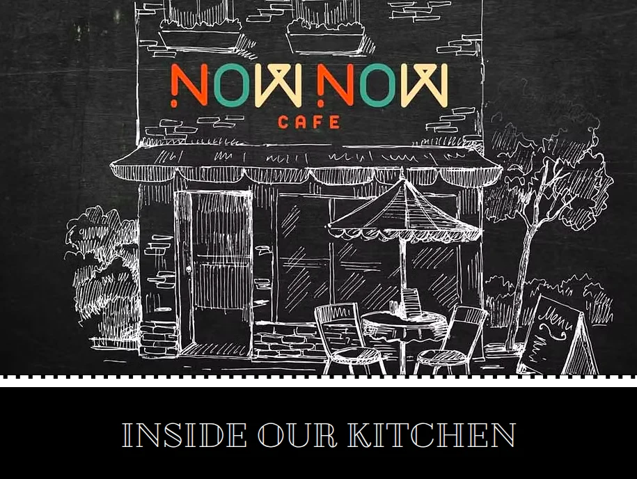
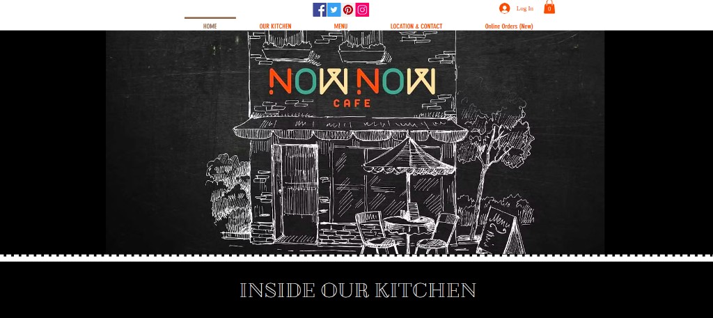
You land on a chalkboard-style hero: the NowNow mark, a hand-drawn cafe storefront, then “Inside Our Kitchen”. Below that, a long, food-led page built for a Centre lunch crowd — skim fast, get hungry, decide. In order, it covers:
- Kitchen / brand story
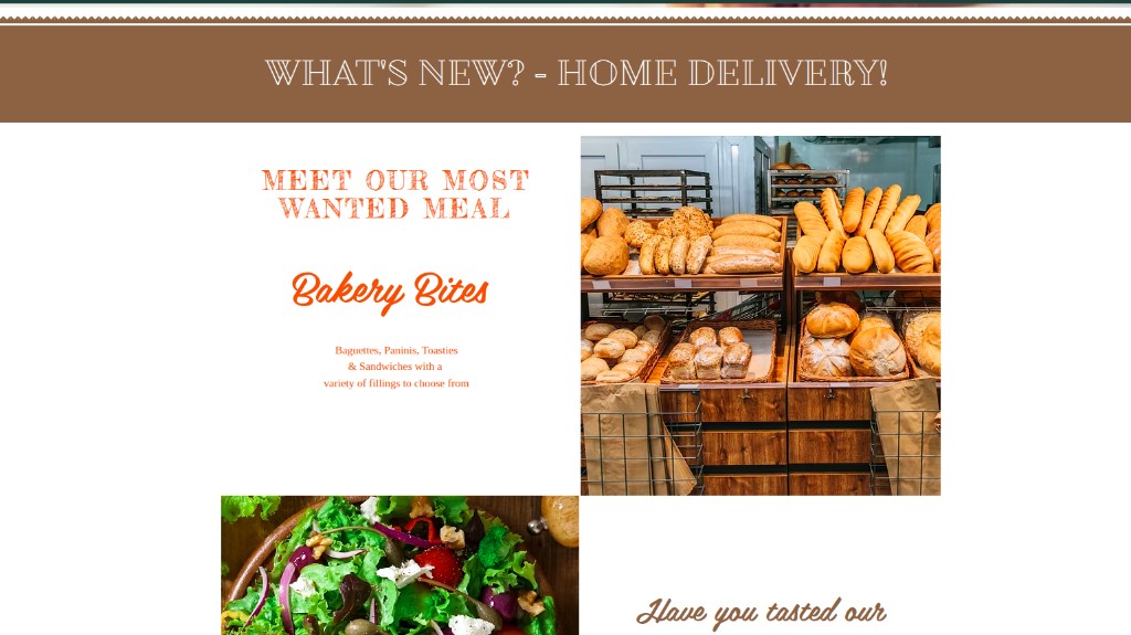
- What’s new (including home delivery messaging)
- Food categories
- A photo gallery
- Location and contact
It feels like a digital menu board with manners — which is exactly what this spot needs.
What we liked straight away
The voice sounds like a cafe, not a brochure. “Cheeky Cajun Bagel” does more trust-building than another stock photo of someone laughing at a salad.
What already works well
Credit where it’s due — there’s plenty working here.
Local clarity
Town in the title. Location and when they’re open are easy to find. Contact is on the page without a treasure hunt.
That’s foundation work. Many nearby sites still hide how to get in touch.
Appetite-led content
The copy has personality:
- “Tummy warmers”
- “Cheeky Cajun Bagel”
- “Crispy New Yorker”
That helps them feel independent next to the big chains in The Centre.
Social proof on the page
There’s a customer quote praising staff, food and atmosphere. Even one genuine line helps the “shall we risk it?” shopper.
Visual food cues
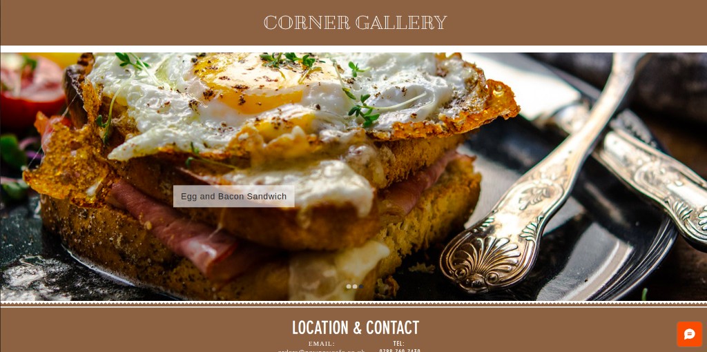
The gallery shows real plates — cakes, coffee, sandwiches. Hungry people decide with their eyes. Photos are doing real work here. (One small note later: give each slide a longer moment to breathe.)
How the site is put together
Google is pointed at a short list of pages. Compact can be a strength — as long as every page earns its keep.
Pages the site lists
| Page | What we found |
|---|---|
| Homepage | Opens quickly when the site is warmed up; feels heavy on a phone because there’s a lot on the page |
| Menu | Page exists, but at review time it was empty — and “Order now” sent us back to the homepage |
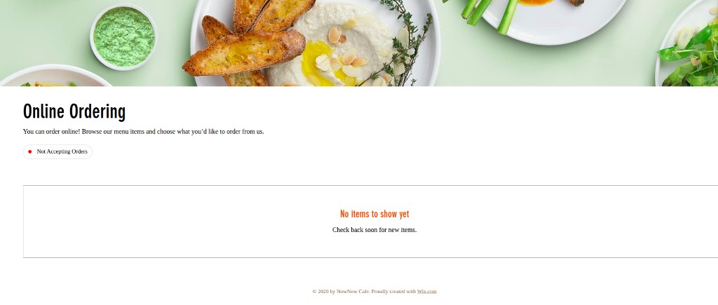
| Online ordering | Page is live, but at review time it wasn’t taking orders and showed no items |
| Shop | Exists; felt slower to start loading on our check |
There’s also a small set of product pages (treats / rusks style items). Those opened fine when we tested them.
Homepage flow
Top to bottom, the story is clear:
- Inside our kitchen — who they are, fresh / vegan angle
- What’s new — home delivery shout
- Menu themes — bakery bites, potatoes, hot food, deli rolls
- Gallery — proof in photos
- Location & contact — how to visit
Sensible path for a rushed lunch decision.
Where the clicks go (and where they could go)
A few friendly navigation notes from walking the site like a customer:
Home and Our Kitchen
Both land on the homepage. Fine if “Our Kitchen” is meant as a scroll cue — clearer still if it opened a short kitchen/story page of its own, or if the label matched what actually happens.
Three invitation cards
Lines like “Order from our vegan menu…”, “Tea and coffee served daily…”, and “All natural ingredients…” are doing good appetite work. At review time each one looped back to the homepage. Those promises deserve their own little rooms — a vegan menu page, a drinks page, a “how we make it” page — so a tap feels like progress, not a merry-go-round.
Menu page
The menu URL exists, but the cupboard was bare when we looked. An “Order now” button from there also returned to the homepage rather than a working order flow. Better to fill the menu, pause the button until ordering is ready, or send people straight to a clear call / directions step.
Owner tip
If a card, button, or nav label sounds like a destination, give it a real destination. Hungry people forgive a short page. They don’t love walking in a circle.
Online ordering: polite, but empty
The ordering page exists on its own — good idea. Marketing and ordering don’t have to live in one messy pile.
At review time it said “Not Accepting Orders” and showed no items.
That’s not a dunk on the cafe. Kitchens pause. Systems get switched off. For a customer, though, an empty ordering screen is like turning up to a locked door with the lights still on.
Friendly fix
When ordering is paused, swap the empty screen for a warm note: “Online ordering’s having a sit-down — call us for today’s specials” plus a big tap-to-call button. Same honesty. Better vibe.
Design: what’s strong, and where it could feel more “them”
Strengths
- Warm, food-first visuals
- Headings you can skim
- Contact details easy to find
- Writing that sounds like a real Livingston cafe
Areas for improvement (said kindly)
Typography
The logo has character. Section headings like “Inside Our Kitchen” feel a touch more generic beside it — thin, familiar, a bit “template default”. Warming up the type pairing would help the words feel as distinctive as the chalkboard drawing.
Platform / build
The site runs on an all-in-one website builder (Wix). Plenty of good local businesses start there — no shame in that. For a cafe as known as NowNow inside The Centre, a more tailored build can feel closer to the brand: sharper design control, cleaner customer journeys, and less of a “template” first impression. Think of it as a growth step, not a telling-off.
Reviews strip
There’s customer praise on the page — good. On our pass, dark text sat over a busy background image, so the words fought to be read. A calmer panel, stronger contrast, or a soft overlay would let the compliment land.
Corner Gallery pace
The food photos are doing the selling. The slider moves a little quickly — captions fade in, and you’re barely finished reading before the next frame. A slower dwell (or a pause-on-hover) would let the plate do its job.
Live chat panel
Handy to offer a chat. When we opened it, a large grey block appeared where an image or branding seemed meant to sit — it read a bit unfinished. Tidying that empty zone (or a simple logo / “we’re around” message) would make the chat feel as warm as the counter.
Mobile layout
Most Centre lunch decisions happen on a phone. On our pass the small-screen layout felt out of sorts — sections overlapping or hiding each other, bits of content hard to see, and at least one stretch of empty white space that looked more like a broken block than intentional breathing room. Worth a dedicated mobile tidy-up so the food and next steps stay easy to reach with one thumb.
Other polish
- One clearer next step near the top (Call / Menu / Directions)
- Give the three homepage invitation cards their own short pages
- Fill or pause the empty menu page; don’t send “Order now” home in a loop
- When the shop or ordering is quiet, say so in plain English
- Keep contact wording consistent across the website, Google listing, and The Centre listing
Behind the scenes — in plain English
Here’s what our checks meant for a busy owner, without the jargon.
What’s in good shape
- They have their own web address (nownowcafe.online)
- Ordering has its own page
- How to visit / get in touch is on the site
- The padlock / secure connection is on
- Typing the site with “http” still lands you on the secure version
Speed and weight
- The homepage can appear quickly once the site is warmed up
- Some inner pages (shop / products) felt slower to get going on our check
- The homepage is a big download — fine on good Wi‑Fi, heavier on a phone in the mall
In human terms: the welcome mat can arrive fast, but some side rooms take a wander to open. Compressing photos usually helps more than rewriting the whole brand.
Extra browser “locks” some platforms don’t switch on by default weren’t present. For a cafe site, we’d still prioritise trust and clear next steps over chasing every technical checkbox.
Broken paths we poked
We tried a few common page names that customers (or old buttons) sometimes expect:
| Path people might try | Result |
|---|---|
/contact |
Not found |
/about |
Not found |
/blog |
Not found |
That’s fine if nothing important points there. It’s still worth checking that no old button or Facebook link sends people into a dead end.
Getting found online — practical next steps
Already helping them:
- “Livingston” in the title
- Location clear on the page
- Food words people actually search
- A listing on The Centre’s own site
- An ordering URL of their own (even when paused)
Worth doing next:
- A short, human description for Google that mentions The Centre / Almondvale
- A real, filled menu page (or hide it until it’s ready)
- Match name, place, hours and photos on the Google Business Profile
- Make the phone number tappable, and the address open in Maps
- A couple of reviews that naturally mention Livingston Centre
- Don’t leave empty order / menu screens as the thing someone lands on from Google
Helping hungry people take the next step
A Centre cafe website has three jobs:
- “This looks good”
- “They’re open / nearby”
- “Here’s what I do next”
NowNow covers a lot of (1) and (2). To strengthen (3):
- Persistent Call and Directions on mobile
- A hero dish near the top when you can
- Delivery area in plain English when delivery is on
- A friendly fallback when ordering is off
- CTA cards and nav labels that open real destinations
Small businesses don’t need twelve steps. They need clarity before the sandwich gets cold.
Friendly recommendations (in order)
If we were pairing with NowNow, we’d suggest:
- Fix the mobile layout first — overlapping sections, hidden content, and empty white gaps so the phone view is actually usable in The Centre
- Warm fallback on the empty ordering screen + tap-to-call
- Fill the menu page — or pause “Order now” until it leads somewhere useful
- Give the three homepage invitation cards their own short pages
- Clarify Home vs Our Kitchen (scroll cue, or a real kitchen page)
- Slow the Corner Gallery dwell so captions can be read
- Lift contrast on the reviews strip
- Tidy the live-chat empty grey panel
- One clear button near the top of the homepage
- Tappable phone + Maps link on the address
- Lighter photos so phones don’t struggle
- Match contact details across website, Google, and The Centre listing
- Look at warmer typography and, when the time’s right, a more tailored site build that feels as unique as the cafe
None of that asks them to become a different brand. The personality is already there.
What other local owners can steal
If you run a place in Livingston — or anywhere nearby:
- Name your town on the page
- Show real food / real work
- Put hours and phone where thumbs can find them
- Make sure every “Order online” promise has a good destination
- Keep the voice human
- Don’t settle for “basic” design if the brand in the real world is anything but
- Practical website work. Not a slide deck.
The walk away
We left NowNow’s site with a clear picture: an independent Livingston Centre cafe with a welcoming online presence, solid basics, and a handful of high-leverage tidy-ups — including design polish that would make the screen feel as memorable as the counter.
After the review we took a slow loop through The Centre instead of rushing to the car park — the kind of ordinary Livingston afternoon where you notice how many chains sit beside places like this. Independents deserve websites that work as hard as the people behind the counter.
That’s On the Ground.
If you want a calm look at your own site — design, search, speed, conversion — we do that from Broxburn for businesses across Livingston and the towns around it.